Talk:Prophecy
Lead Image?
If/when we set up sidebars for the former plot point categories, this article is going to need a lead image. Any ideas?--Hardvice (talk) 01:43, 30 December 2006 (EST)
- I don't think it should be a prophecy, simply because that would be redundant. Maybe a picture of Isaac with his eyes glazed over? I'm open to other suggestions, of course... - RyanGibsonStewart (talk) 15:45, 30 December 2006 (EST)
- I added as the lead pic an image of Isaac seeing Claire and then "painting" her. Besides the pic being an awful version and needing to be reuploaded, I just wanted to get some feedback as far as the infobox is concerned. I put it into a power infobox, because that was the closest thing I could think of - nothing else works. It is on the powers portal page, afterall. Unfortunately, so is Power theft, which has a different infobox. I think the 2 different infoboxes are fine, given that prophecy really is an extension of a power, and power theft is probably not a power at all (though both still belong on the portal page). Blah blah blah. Any objections to the infobox? - RyanGibsonStewart (talk) 19:01, 13 January 2007 (EST)
Layout Commentary
This is going to look amazing when they are all cropped to match! The only thing we'll need to be careful of is the caption length. If the captions are too dissimilar in length, it can throw the formatting off. Maybe we can force a valign=top to minimize the effect?--Hardvice (talk) 04:54, 2 December 2006 (EST)
- It looks fantastic! Yeah, I think finagling the captions to be more uniform will help. I seriously get goosebumps when I see some of these pics side-by-side ... I know, I'm a dork! - RyanGibsonStewart (talk) 07:06, 2 December 2006 (EST)
- Nicely done! The gallery of Isaac's paintings is already a popular page. I see links to it on a number of sites and blogs because people want to see a collection of all of Isaac's paintings. I think this page will become very popular as well. (Admin 08:47, 2 December 2006 (EST))
- I wasn't sure about this, but it really does look great! My only problem is with the last set of images. I'm not convinced that the "burning figure" was Peter. May as well leave it for now, until we have more proof of this, however. - Yoshie (talk) 09:11, 13 December 2006 (EST)
- Thanks! I think as far as the Peter/burning man connection is concerned, we should leave it - right now, the writers seem to be leading us to make that connection. (Plus, there's really no other viable explantion or visual as of yet, even though the "realization" is just a vision.) I agree we should leave it, unless something else happens. Who knows, maybe Peter won't explode, but Isaac's painting will come true in another unforseen way. - RyanGibsonStewart (talk) 10:11, 13 December 2006 (EST)
I realize the images are grouped by the episode in which the prophetic painting appeared, but it can be confusing when the fulfillment of the prophecy occurred in an earlier episode. Would it be hard to separately identify the prophecy ep and the fulfillment ep? --Ted C 15:02, 9 January 2007 (EST)
- It's a little bit hard, but not impossible. I would actually suggest just putting some kind of note in the caption about when the prophecy was realized. For instance,
| Isaac's Work | Realization |
|---|---|
 (Genesis) |
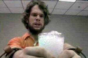 (Seven Minutes to Midnight) |
I think something like that would be beneficial for a number of reasons. - RyanGibsonStewart (talk) 15:25, 9 January 2007 (EST)
- There. That should do it. Hopefully that helps clear up when the realizations took place. - RyanGibsonStewart (talk) 01:58, 10 January 2007 (EST)
Caption Length
Thanks, Admin, and thanks as always for all your hard work, Hardvice ... Okay, I've uniformed the length of each pair of captions in most cases. Some issues:
The painting of Simone needs to be resized, or (better yet) the screencap of Simone can be made more vertical.The burning bus needs to be cropped - maybe take out the billowing smoke.The actual pic of the train wreck needs to be slightly resized - otherwise, we can add another line on the captionPainting peter flying.jpg should be resized.Also, do we have a better picture of Peter flying/falling, preferably from the front?I left the nuclear explosion as is, and the differing caption lengths hopefully make up the difference. Do you think it works?Claire and Zach need a slight adjustment: either the painting taller, or the screencap shorter. Right now, the captions are different lengths to accomodate. Should we leave it?Can we get a vertical screencap of Simone and Peter kissing?Peter and the flying locker doors are different sizes, but the captions make up the difference. Okay to leave?Claire frightened needs to be taller, if possible.I'm not sure what to do about Jackie's death. The painting is too tall, and the screencap to short. Perhaps make the screencap more vertical, and crop off some of the lockers on the left?Can we get a better pic of Jessica - peferably one of her looking over her shoulder as in the picture... Maybe something from the Linderman's tape story....Painting charlie.jpg needs a bit cropped off the bottomThe captions for Peter at Homecoming are the same length. Can we fix the images? Otherwise, we can shorten/lengthen the captions
I tried to do some cropping on my own, but of course I'm blessed with a crap computer. It's like a Commodore 64, I swear.
Thanks for all your help! - RyanGibsonStewart (talk) 09:10, 2 December 2006 (EST)
- I'll go ahead and crop 'em then. I'd really like to standardize all of them at 300x200. It will make the page look a) more like a table and b) more professional.--Hardvice (talk) 12:46, 2 December 2006 (EST)
- Actually, if it gets really looking really clean, I'd say lets flesh it out with some text, and nominate it for AOTW during the break. - RyanGibsonStewart (talk) 13:10, 2 December 2006 (EST)
- Can't tell you how great this page looks now - thanks, Hardvice! - RyanGibsonStewart (talk) 22:30, 2 December 2006 (EST)
- The last few changes to those pictures make a difference - looking good! - RyanGibsonStewart (talk) 23:41, 3 December 2006 (EST)
- Can't tell you how great this page looks now - thanks, Hardvice! - RyanGibsonStewart (talk) 22:30, 2 December 2006 (EST)
- Actually, if it gets really looking really clean, I'd say lets flesh it out with some text, and nominate it for AOTW during the break. - RyanGibsonStewart (talk) 13:10, 2 December 2006 (EST)
9th Wonders! Comic Pages
- Do the comic pages from the 9th Wonders comics count as Prophecy? --Orne 17:24, 4 December 2006 (EST)
- They should. *Sigh* More screencaps. ;) --Hardvice (talk) 17:34, 4 December 2006 (EST)
- OMG, this page is really fantastic - I am so impressed! ... Is it getting long? I was wondering if we should somehow separate the table into easily navigable section (ie, using a TOC). For instance, a section for prophecies about homecoming. Another, of course, for 9th Wonders prophecies. Any thoughts? - RyanGibsonStewart (talk) 23:26, 12 December 2006 (EST)
- I'd say either by episode (of either the work's first appearance or the payoff, but the work makes more sense) or separate out the paintings from the comics into two sections (not much improvement, really)--Hardvice (talk) 23:39, 12 December 2006 (EST)
- OTOH, if we split it into painting and comics, we could make it two side-by side tables -- 4 images wide instead of 2. Since they're thumbs, there shouldn't be a width problem, since low res users probably have a low-res thumb size specified. Galleries are 4 wide anyway.--Hardvice (talk) 23:45, 12 December 2006 (EST)
- Yeah, I like that idea a lot - the two tables, side-by-side. They won't extend to the same spot on the bottom, but I think that's okay. That's definitely the best idea. - RyanGibsonStewart (talk) 23:49, 12 December 2006 (EST)
- One problem: I just tried it, and it makes the differences in caption length very distracting. In one table, it automatically matches up the size of the cells. Two tables doesn't. It looks kind of icky. I'll add it at Prophecy/test so you can eck it out.--Hardvice (talk) 23:51, 12 December 2006 (EST)
- Right, right, I agree with you - not the best. (Come on, give yourself a bit more credit - it's not "icky"!) Well, we could leave it as a big long table, or split it into a few sections. If we do sections, I don't think just 2 (paintings and comics) would be the best. I liked your idea of doing it by episode. It sort of fits with the format of the rest of the site. But I'm also thinking that one big table might make the impact bigger. I don't know - I'm going back and forth - I'm such a namby pamby! :) - RyanGibsonStewart (talk) 00:00, 13 December 2006 (EST)
- Ok, check it out now (Prophecy/test) I combined the two columns into a single table, decided it still looked bad, then converted it to a Template to autogenerate the rows --Orne 11:29, 13 December 2006 (EST)
- Looks great, apart from the borders being a tad oppressive, but we can adjust that.--Hardvice (talk) 12:23, 13 December 2006 (EST)
- HTML note: in a TABLE element, the CELLSPACING variable creates the white borders outside of the cells, and the CELLPADDING adds whitespace between the border and the text area. I think you have to use style="border: solid 1px white" in the TD element to change the individual cell's border. --Orne 12:32, 13 December 2006 (EST)
- I tried a bunch of different borders, but they just always seem like too much. What do you think of the current (borderless) version? It also has the advantage of not generating any (visible) empty cells.--Hardvice (talk) 12:41, 13 December 2006 (EST)
- (I think we need to start a new discussion for this topic sometime soon...) - I like the borderless version a lot. So much cleaner. I especially like that the pics can be centered (the right-aligned version was irking me a bit), and that there's no clutter. My only concern is that the caption under the pic is very close to the next pic. Can we put a little more space between each row? (maybe add another invisible row between each? I tried adding a break between each one, but all the breaks were pushed to the top. Help!) - RyanGibsonStewart (talk) 13:54, 13 December 2006 (EST)
- I tried a bunch of different borders, but they just always seem like too much. What do you think of the current (borderless) version? It also has the advantage of not generating any (visible) empty cells.--Hardvice (talk) 12:41, 13 December 2006 (EST)
- HTML note: in a TABLE element, the CELLSPACING variable creates the white borders outside of the cells, and the CELLPADDING adds whitespace between the border and the text area. I think you have to use style="border: solid 1px white" in the TD element to change the individual cell's border. --Orne 12:32, 13 December 2006 (EST)
- Looks great, apart from the borders being a tad oppressive, but we can adjust that.--Hardvice (talk) 12:23, 13 December 2006 (EST)
- Ok, check it out now (Prophecy/test) I combined the two columns into a single table, decided it still looked bad, then converted it to a Template to autogenerate the rows --Orne 11:29, 13 December 2006 (EST)
- Right, right, I agree with you - not the best. (Come on, give yourself a bit more credit - it's not "icky"!) Well, we could leave it as a big long table, or split it into a few sections. If we do sections, I don't think just 2 (paintings and comics) would be the best. I liked your idea of doing it by episode. It sort of fits with the format of the rest of the site. But I'm also thinking that one big table might make the impact bigger. I don't know - I'm going back and forth - I'm such a namby pamby! :) - RyanGibsonStewart (talk) 00:00, 13 December 2006 (EST)
- One problem: I just tried it, and it makes the differences in caption length very distracting. In one table, it automatically matches up the size of the cells. Two tables doesn't. It looks kind of icky. I'll add it at Prophecy/test so you can eck it out.--Hardvice (talk) 23:51, 12 December 2006 (EST)
- Yeah, I like that idea a lot - the two tables, side-by-side. They won't extend to the same spot on the bottom, but I think that's okay. That's definitely the best idea. - RyanGibsonStewart (talk) 23:49, 12 December 2006 (EST)
- OMG, this page is really fantastic - I am so impressed! ... Is it getting long? I was wondering if we should somehow separate the table into easily navigable section (ie, using a TOC). For instance, a section for prophecies about homecoming. Another, of course, for 9th Wonders prophecies. Any thoughts? - RyanGibsonStewart (talk) 23:26, 12 December 2006 (EST)
- They should. *Sigh* More screencaps. ;) --Hardvice (talk) 17:34, 4 December 2006 (EST)
Table width
The table seems a little off-balance. I know this is a small thing, but the left column of the table is a little wider than the right. I wouldn't really mind, but the column headings seem to be equal, so the division between the two does not match up. Any chance someone could check into this? Thanks! - RyanGibsonStewart (talk) 15:19, 5 December 2006 (EST)
The Infallible (?) Isaac Gallery
On NBC's Heroes message boards there is a thread called The Infallible (?) Isaac Gallery, it has some that are missing from here, mostly when Hiro follows the comic and Peter's Prophecies (there is one here but it is marked as Isaac's), theirs are low quality and not completely accurate but they should be checked. -Level 03:19, 26 January 2007 (EST)
- That's a great link. It's good to see that others have some of the same ideas as we do. I agree, they have some flawed theories (I don't buy that anybody changed the future at Homecoming - I think the shadow on the steps was Peter all along) and mistakes (I'm also not buying that Jessica beating up her dad is the cover of 9th Wonders, Issue #9). It's also poor quality, but that's okay. They did have a few that we don't have (mostly Isaac's sketches of the BTD) & I'll get to work on those as best I can. Thanks for the link! - RyanGibsonStewart (talk) 09:44, 26 January 2007 (EST)
Peter's doodle
I added the doodle Peter did while in the hospital. It's not Isaac's, but I think it still fits under the category of "prophecy". He had been doodling it earlier, and then fulfilled it without knowing. The way the episode is edited lends itself to the idea that this is a prophecy as well. I don't know how Peter mimicked precognition at this point, but I think we're safe to assume that this was definitely a prophecy. - RyanGibsonStewart (talk) 00:37, 29 January 2007 (EST)
- Well, he was at Isaac's apartment with Isaac the night before (oh wait, have you still not seen Genesis?), but yeah, it's pretty long to have held on to the power compared to his other examples. But Peter himself cites the sketch as an example of him mimicking Isaac's power.--Hardvice (talk) 01:19, 29 January 2007 (EST)
- It may have been pretty long to hold on to a power, but we now know that Peter can mimic powers without the original power holder being present.--Shoreline83 (talk) 13:30, 2 March 2007 (PST)
Difference
I don't know if this is the best place to post this comment, or if it even if it's important enough to be included in any of the acticles, but I've noticed a difference between the paintings Isaac painted of his own death (as well as his corpse that was found by Hiro in the future) and his actual death at the hands of Sylar in .07%. In both the paintings and Hiro's discovery of Isaac's body, Isaac's facial hair is grown out significantly. However, while he does have some stubble, he is comparitively clean-shaven when Sylar kills him. If it were just the paintings that were different, I'd be able to chalk it up to artistic license, but the fact that the conflict extends to Hiro's incident in the future, makes me think twice. What do the rest of you think? Simple continuity error, or evidence that the timeline has shifted? -- Joser Kyind 21:30, 27 April 2007 (EDT)
- Great question, something that I thought about, too. Personally I think (hope) it's a continuity error. Remember, it was in the second episode, which aired more than six months ago, that Isaac's death is first mentioned. I'm not sure the writers (and especially the props department) had everything worked out perfectly at that time--they weren't thinking of what his facial hair would look and stuff, they just wanted us to realize that Hiro finds Isaac's dead body on November 8th. (Side note: hair continues to grow after death, and October Hiro won't find Isaac's body for another week--he might grow some more beard...slightly.) As for the paintings, IIRC, Tim Sale wasn't given any screencaps from which to create the series. I think I remember reading that he was just asked to do a bunch of "brainless Isaac" pictures from various angles. He may not have paid much attention to the details of the actual scene (or not had them available). The show, though intricate and complex, is still a pretty straightforward show. I don't think they'd make a "timeline shift" clue that subtle. — RyanGibsonStewart (talk) 22:57, 27 April 2007 (EDT)
Exploding Man
The Exploding man isn't neccesarily Peter; in the graphing novel (Chapter 30, Fallout), Sylar is the bomb. The future isn't set in stone!
- Good point. But since that is the only image the show has given us of anybody exploding, I think it's best to put it in. If Sylar or Ted or Hana's dad ends up being the bomb, then we'll change the pic. We won't know until the finale, though, will we? — RyanGibsonStewart (talk) 13:32, 30 April 2007 (EDT)
About the eyes thing
What should we do since the prophecy template has only two column. For exemple, this needs 3 columns.
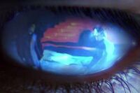


and this two
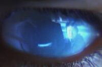
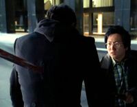
How should we deal with this new way of precognition.